.png?height=120&name=KonaAI-Reversed%20(1).png)
Visualization is the first screen that you can see after selecting the Sub Module for your Insights. In this tab, data is represented in a pictorial format on the left side with the formulas embedded in background and a list of filters displayed on right side.
You may use the filter option to access different features of the dashboard or select the respective values on the dashboard.
The visualization tab consists of 7 main tabs that you can navigate to better understand the analysis.
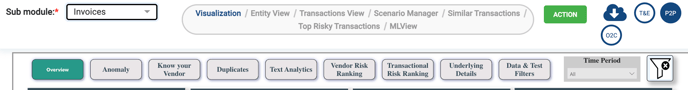
- Overview: Geographic heat map, transaction time series and payment stratification.
- Anomaly: View anomalous invoices and vendors.
- Know Your Vendor: Risk scores by highest risk transaction, risk entities like vendor, customer, employee and business unit.
- Duplicates: Sorts and prioritizes duplicate payments.
- Text Analytics: Analyses the free text payment descriptions in invoices. If there are no text descriptions, this tab will not appear.
- Vendor Risk Ranking: Prioritizes the highest risk vendors based on the overall risk profile of the supporting transactions.
- Transactional Risk Ranking: Prioritizes the highest risk transactions in the population.
- Details: This tab provides a spreadsheet view of each transaction within a selection or filter to enable easy download (export to XLS) or to flag for case creation.
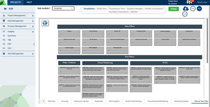
- Data Tests and Filters: Apply filters to gather project specific data or for specific test results.
All these tabs are visible as a banner at the top and bottom parts of your screen.
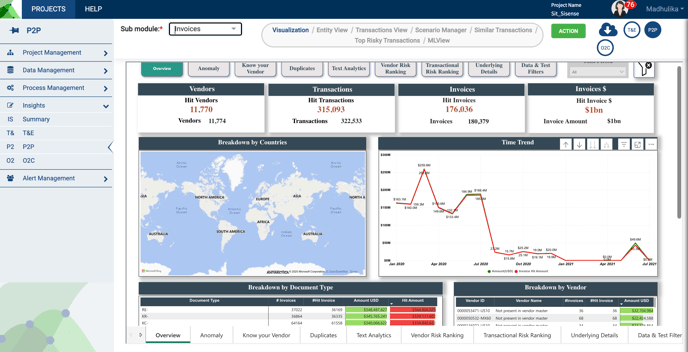
Overview
The Overview helps you to understand your data from a geospatial risk perspective, a time- series perspective, and volume perspective, where the top payees are listed, by payment type, among other factors.
Use this interface to “explore” your data and ensure the dollar volumes, transaction counts, and vendor counts, are what is expected based on your data extraction. You will note the total number of transactions is displayed in a small font, and the hit counts are in the larger, red font.
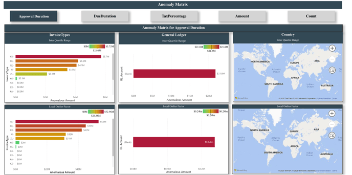
Anomaly
The anomaly feature of the konaAI application provides insights into the anomalous invoices and vendors.
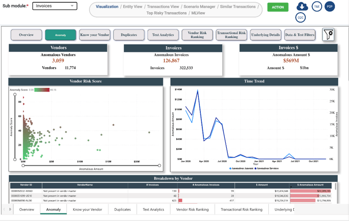
You will further be able to deep dive into the analysis by scrolling through the page to access the evaluation matrix and score features.
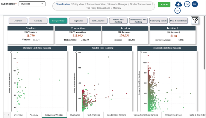
Know Your Vendor
Know Your Vendor helps you to understand the risk ranking for business unit, risk ranking of vendors and transaction.
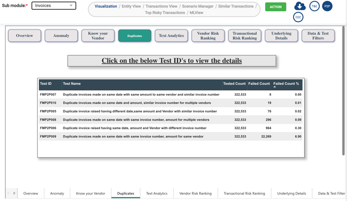
Duplicates
Certain tests are applied to capture duplicate data e.g., an invoice created having same amount, same date, same vendor but different invoice numbers, this is a duplicate invoice. Such anomalies could be filtered out and checked thoroughly here. Click on the “Test ID” to view results.
Text Analytics
Text Analytics helps you to display frequently occurring key words from the files in a Word Cloud. The purpose of a Word Cloud in Text Analytics is to visually represent the most frequently appearing words or keywords in a set of files or text documents. The word cloud provides a quick and intuitive way to identify the most prominent themes or topics within the text data.
This view of presentation provides you with:
- Frequency Visualization: The Word Cloud visually depicts words as different-sized and colored elements.
-
- The size of each word corresponds to its frequency of occurrence in the text data.
-
- Words that appear more frequently will be larger and more prominently displayed in the Word Cloud, while less frequent words will be smaller.
- Key Insights: By glancing at the Word Cloud, users can quickly identify the most significant and recurring themes in the text data.
-
- You can gain immediate insights into the main topics or subjects covered in the files without having to read through each document manually.
- Interactive Representation: Word Clouds often provide an interactive experience.
-
- You can click on individual words to explore further details or view context-specific information related to those words.

Vendor Risk Ranking
As the name suggests, it shows you the number of times a vendor has appeared in your analytics and the risk score assigned to them. You could see the same information in the “Entity View” tab as well.

Transactional Risk Ranking
This tab gives you the transactional information of the risk entities, in this case the Vendor and is populated under the “Transactions View” as well.

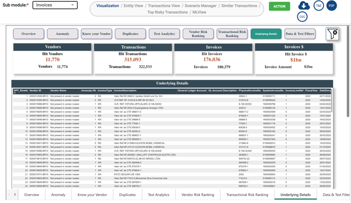
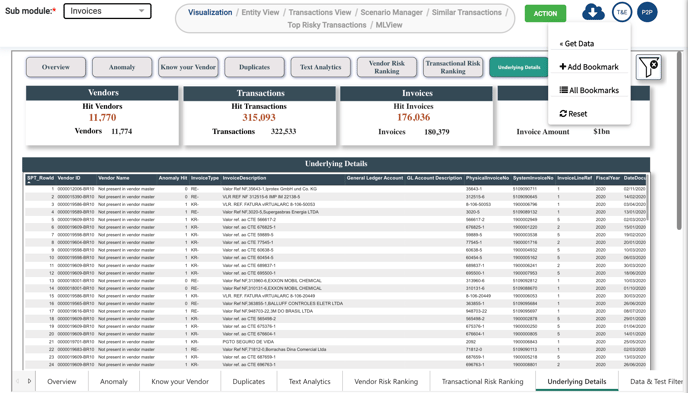
Underlying Details
The Underlying Details displays the information in the Overview section. When filtering different dashboards, you can "drill through" to view the underlying data of any specific data point. After that, you can use the "Get Data" feature.
Get Data
Click on the green “Action” button at the top of your screen to access the following options.
- Get Data: Displays the data in a view mode only.
- Bookmarks: After applying any filters in the dashboard, you can save the filter settings using the “Bookmark” option.
-
- Bookmarks can also be shared with others.
-
- All Bookmarks: Displays the complete list of bookmarks available.
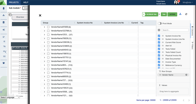
Clicking on the “Get Data” button results in a new screen appearing on the work area where all the data from the dashboard is represented in a grid format. You can interact with the data by applying filters and selecting columns that you wish to see in the grid.
This functionality provides you with an actionable approach to data analysis and risk management. Any filters applied on Dashboard are carried forward in the “Get Data” screen as well.
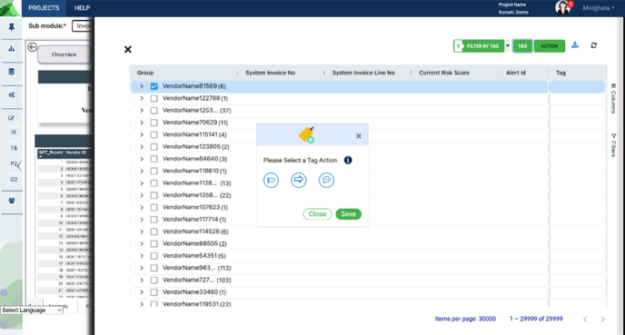
You may create a case alert for identified risk by ticking the check boxes of the given vendor and then clicking on the Create Alert button, under the green “Action” button. This can be done at different levels, including:
- Creating Case Alerts with the Action Button: Use the action button to create case alerts for identified risks. Entity-Level Alerts: Create alerts for specific entities such as vendors, customers, or employees.
- Transaction-Level Alerts: Generate alerts, one per individual selected transactions, when they require further investigation.
- Multi-Transaction Alerts: Combine multiple transactions into a single alert to address complex scenarios involving multiple data points.
You also have the option to apply tags and export your data.
- Tagging: Apply tags to transactions to downgrade or flag, including comments. Tagging helps in organizing the data and identifying trends or patterns.
- Filter by Tag: Use the filter by tag button to quickly filter transactions based on applied tags. This allows for efficient data management and targeted analysis.
- Exporting Data: Export filtered data for further analysis or reporting. This function allows you to download the data as .csv or *.xlsx
You may use the X button to exit the slider screen and go back to Data Visualization.
Data Tests and Filters
You can apply Data Filters such as vendor, company code, or general ledger account using the filter button. Test Filters can be applied if you are interested in specific test results. After selecting your filters, click on the blue back button to apply them to your view.
To view other versions of your filtered data, you can right-click and choose “Drill Through” to see other ways of viewing your data.